How Typography Boosts User Engagement
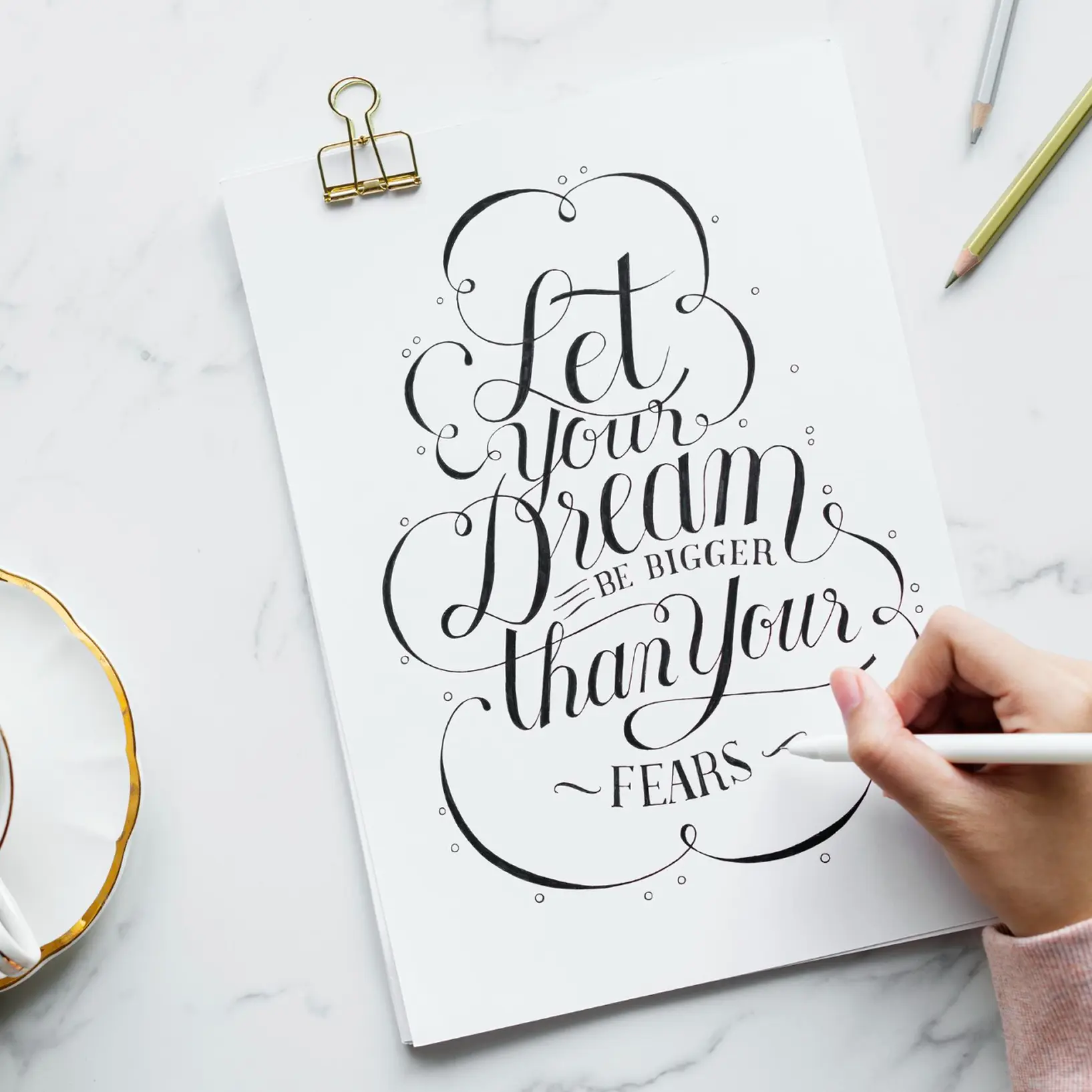
Typography isn’t just about picking pretty fonts—it shapes how users interact with your site. At Bright Form, we use typography to create engaging, readable designs. Here are three typography tips to elevate your website.
1. Prioritize Readability
Clear text keeps users on your site longer.
- Choose legible fonts: Opt for sans-serif fonts like Roboto for digital screens.
- Adjust font size: Use 16px or larger for body text.
- Increase line spacing: Add 1.5x spacing for easier reading.
Readable text improves user experience and retention.
2. Create Hierarchy
Visual hierarchy guides users through your content.
- Use bold headings: Make headers larger and bolder to stand out.
- Vary font weights: Mix light and bold styles for emphasis.
- Break up text: Use subheadings to organize long sections.
A clear hierarchy helps users find what they need.
3. Align with Branding
Typography should reflect your brand’s personality.
- Match the vibe: Use playful fonts for creative brands or sleek ones for tech.
- Limit font families: Stick to 2–3 fonts for consistency.
- Test for accessibility: Ensure text contrasts well with backgrounds.
Brand-aligned typography builds recognition and trust.
Why Typography Matters
Great typography enhances readability and reinforces your brand. These three tips can make your site more engaging. Want standout designs? Bright Form’s team is ready to help—reach out today.


.svg)


